What New Yorkers Complain About - An Infographic of 311 Data
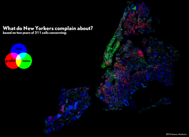
This map of 311 data shows the complaints that the city receives, visualized in three categories: Graffiti, litter, and noise complaints.
Created by Dietmar Offenhuber of the MIT SENSEable City lab, the map shows blocks of the city shaded according to the percentage of complains that area filed by calling 311. If an area is more green, it had more noise complaints. More blue, more litter complaints. And blocks in shades of red received more graffiti complaints.
View the larger map below or on the Visualizing.org website to zoom in to your block! Does the type of complaint match what you see in your part of the city?
“What do New Yorkers complain about?” via dietoff on Visualizing